
December 2019
Written by: Brett Power, CFA®, CFP®, MBA
Who wants to talk about bonds? These mundane, low return investments are only for the exceptionally conservative and older investor… right? Although this seems to be a common perception of many investors, there may be more to love than you realize. So, before you scroll back to reading about high flying tech stocks, and the most recent IPO, allow me to attempt to make a case for these seemingly boring investments.
First of all, the bond market is significantly larger than the stock market. In my opinion, it is also more diverse in style. Stocks tend to be more uniform in structure, while bonds can each have unique qualities that provide differing benefits, risks and rewards. In other words, bonds are not all made equal. The bond market also provides a unique perspective on stocks. They give us some insight into which sectors of the stock market may provide opportunities and help diagnose when stocks are potentially overpriced or underpriced relative to historic norms and trends.
Before we jump into current bond market conditions, let’s take a look at why having bonds in almost any portfolio can make sense.
If we compare two simple portfolios over the last 20 years you may be surprised at the results.
| Statistics | All Stock Portfolio | 70% Stock 30% Bond Portfolio |
| Average Annual Return 1999-2019 (past 20 years) | 6.55% | 6.38% |
| Max loss in one calendar year (2008) | 37.18% | 24.53% |
| Standard Deviation | 12.86% | 8.85% |
| Upside Capture | 100% | 97.40% |
| Downside Capture | 100% | 66% |
*Portfolio back tested using Fidelity Total Market Index as proxy for the broad stock market and Vanguard Total Bond Index as proxy for the bond market. Portfolios were rebalanced annually. Past performance is not indicative of future results. The data above is provided for educational purposes only and is not intended as investment advice.
Investors who chose to allocate a portion (in this case 30%) to the broad bond market ended up capturing over 97% of the total stock portfolio return but retained only 68% of the risk! The bond proxy in the example above only averaged 4.9% return over that 20 year period – significantly less than the sock portfolio. However, by adding it to the portfolio it only decreased the average annual return by .17% (if you are doing the math, you are probably coming up with a different number: (.7 x 6.55) +(.3 x 4.9) =6.05) this is due to the inverse correlation between stocks and bonds (when stocks go down often bonds go up). Reducing the risk level in a portfolio not only helps smooth out the returns, but also helps investors stick to their investment strategy during tough market environments.
So, we can probably agree that having some bonds in a portfolio adds value even for the most aggressive investors. Now, let’s take a look at how the bond market is currently positioned and how different types of bonds can provide dramatically different results over time.
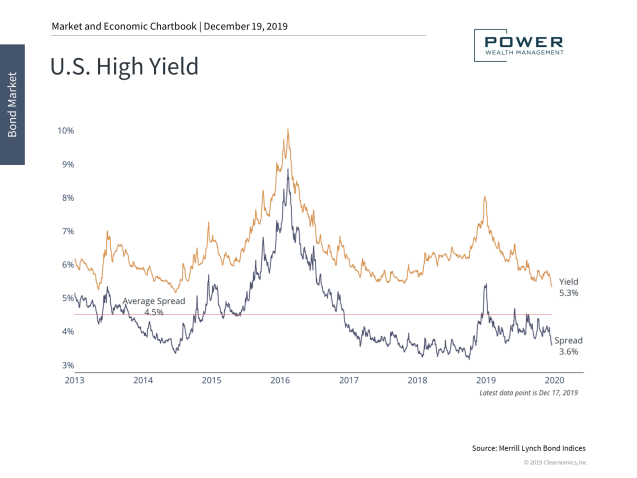
One of the bond markets we track diligently is the high yield sector [1] (formerly known as “junk bonds” – high yield sounds much better right?). High yield bonds are what you get when you loan a high risk company money. Consider it this way, you have two friends that ask you for a loan. One is a local physician who is expanding his medical practice and needs the funds to build out his new office. The other is your 21 year old nephew who needs the funds to start a podcast discussing his new vegan diet. There is, most likely, a much higher probability that the physician will be able to repay you. You would require a much higher rate of interest on your nephew’s loan to justify lending him the funds. This is true of encounters with high yield bonds in the bond market as well; when you lend a risky company money, they must compensate you with a higher rate of return in order to compensate for the possibility that they won’t be able to repay the principal.
We like to keep a close eye on high yield spreads. These are simply the additional yields the average junk bond pays when compared to a risk-free treasury bond [2] . If the spread is low, this implies that investors are not being paid much for taking on additional risk. Alternatively, higher spreads provide investors with a better interest rate return as the market is pricing in more risk of default. This data can provide a unique insight into how risky the overall stock market could be.
With the path of interest rates uncertain, high yield continues to be a popular source of income for many investors. Spreads widened significantly in 2008 and in 2015 when oil prices plummeted, placing pressure on the issuances of energy companies. Spreads widened again at the end of 2018 on global market concerns, but have recovered since. Currently, spreads are well below average. There remains the potential that economic risk could drive these spreads back to their average in the future. Based on this data, we believe that high quality bonds should remain a core component of investors’ portfolios and have reduced the allocation to high yield bonds.
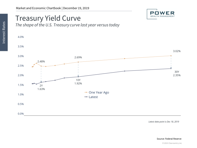
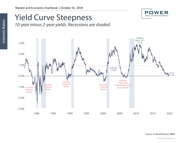
Over the past few months there has been significant discussion around an impending recession. The perspectives from the media can be drastically different. Much of this conversation is due to concerns over the “inverted yield curve”. This is simply when short term interest rates are higher than longer term rates (2-year vs 10-year). Let’s look at some unbiased data to provide some context.
The yield curve continues to flatten and has begun to invert. This is problematic because an inverted yield curve is a known and closely watched recession indicator. However, it’s important to remember that this is a process, not an overnight event. Much of the recent inversion is a result of falling long-term rates due to the Fed combined with economic uncertainty. The chart below shows the yield curve now as compared to one year ago. You will notice that the “front end” of the curve has gotten much less steep.
Over the past several years, the Fed raised short-term interest rates but has now reversed this policy stance. Yield curve flattening typically signals the later stages of a business cycle, ultimately resulting in an inverted curve. Full inversions historically signal recessions, but often with a long lead time of 9-23 months. The chart below shows yield curve inversions and the gray bars are corresponding recessions. Clearly, the predictive power of yield curve inversion has some validity. On the other hand, counterintuitively, stock prices do have a history of moving higher shortly after an inverted yield curve arrives. What comes to mind is Ben Bernanke’s description of “irrational euphoria” prior to a correction.
Let’s talk about corrections: they happen, and they are expected to happen. Thankfully, these short-term events provide a great opportunity for the astute investor. Going back to 1980 (see below) there have been numerous corrections. In fact, nearly every year we are presented with an opportunity to purchase companies at a discount.
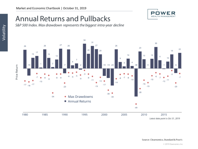
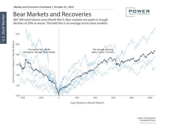
A correction of greater than 20% is what is required for a decline to be classified as a “bear market”. The chart above shows bear market pullbacks since World War II. The average bear market sees the market fall (-35.8%) from peak to trough, taking about a year and a half. Recoveries from these levels take 2 years 5 months on average, depending on the underlying economy and fundamentals. The chart below shows historical bear markets and their corresponding recovery.
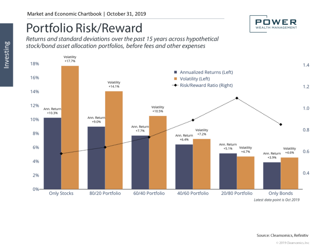
Most retirees cannot afford to take a 35% haircut on their retirement accounts. This is why making sure your current allocation is appropriate for your situation and that you have adequate diversification (you will love those bonds during these times). The chart below shows the historical risk and return profiles of various stock/bond portfolios. For instance, while an all-stock portfolio has the highest return, it also has the highest volatility. Selecting the best stock/bond allocation depends on personal characteristics and financial goals. Consider the 40/60 portfolio. This allocation historically has captured around 62% of the upside in the stock market while only experiencing 40% of the volatility. In essence it smooths out the ride for the investor. This is exceedingly important, especially for those who are using some of their investments each year to provide income.
Stocks and the upcoming Presidential Election
Are you ready for a “Tweet Storm” in 2020?
With the next presidential election less than a year away, many investors are bound to be concerned by the impact of politics on the stock market and economy. After all, the past three years have been politically turbulent to say the least. Even as we write this, Washington has been working through an impeachment hearing. On a short-term basis, headlines and tweets have the power to move markets and create stock market volatility. How should investors react to what may be a bitter presidential campaign?
It goes without saying that as citizens, taxpayers and voters, elections are extremely important – regardless of which side of the aisle you’re on. Elections both reflect and determine the principles we want to uphold and the way of life we hope to sustain.
However, as investors, politics can often distract us from achieving our long-term financial goals. Government policy can certainly have an impact on economic growth – e.g. around corporate taxes and trade – and can also affect specific stocks, bonds, and sectors. However, for most long-term investors, it makes more sense to focus on economic and market fundamentals rather than day-to-day election coverage.
This is because the relationship between politics and the stock market is not a simple and obvious one. While there may be conventional wisdom about how each political party may affect the economy, these views actually have an abysmal record when it comes to predicting stock market returns. Not only is economic policy difficult to evaluate, the implementation and enforcement of such policies takes time. And even when investor predictions are correct, the market tends to price in these facts well ahead of time.
For instance, what tends to drive markets over the long run are economic trends, especially when it involves innovation. This is perhaps best illustrated by the 1990s: the Clinton era happened to coincide with the tech boom while the dot-com bust coincided with the George W. Bush presidency. It would be a stretch to argue that their presidencies caused the boom and bust, respectively.
Many of the simple statistics that are often used to prove a political point don’t take these factors into account. A basic average of S&P 500 returns during Democratic and Republican presidencies since World War II shows a clear advantage for Democrats. However, not only are there outliers like the dot-com bust and the 2008 financial crisis that happened to occur during Republican years, but incorporating a lagged effect into the data essentially washes out the difference.
More importantly, even if there is a large difference, it’s clear that returns are positive under both parties. Jumping out of the market due to the outcome of an election means potentially missing out on positive historical average gains.
When it comes down to it, long-term investors should be wary of claims that one candidate or another will “kill the market.” It’s likely that this has been said about every president since the founding of modern stock exchanges. In recent times, it was certainly said about both Presidents Obama and Trump, and is now said about a variety of candidates. To be clear, this doesn’t mean that these candidates have sound economic plans – it simply suggests that markets are hard to predict.
Thus, the best course of action for long-term investors – regardless of political preference – is to stay invested and maintain the discipline to avoid reacting to political noise. Below are three charts that put this important topic in perspective.
1. There’s no simple relationship between elections and the stock market
Presidential Elections and Stocks
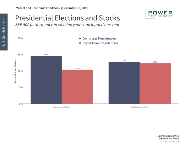
A simple average of stock market returns under Democrats and Republicans shows a clear advantage for Democrats. However, not only are there outliers including the dot-com bust and the 2008 financial crisis that happened to fall under Republican years (and arguably had nothing to do with which party was in office), but it can take years to fully see the effect of economic policies.
Incorporating a lag into the data shows that there’s hardly any difference in stock returns between the two parties since World War II. More importantly – stock returns are positive on average regardless of presidential party. Thus, making portfolio decisions based on political preference can often result in poor results.
2. Election years are not too different from non-election years
Stock Markets in Election Years
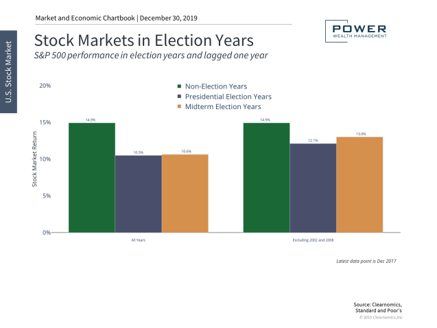
While it does appear to be the case that non-election years tend to have higher returns on average than election years, this difference is minimal after excluding 2002 and 2008. Additionally, the fact that all years are positive means that avoiding election years is generally not the right approach.
3. In the long run, it’s the economic trends and innovation that matter
Stock Market Cycles
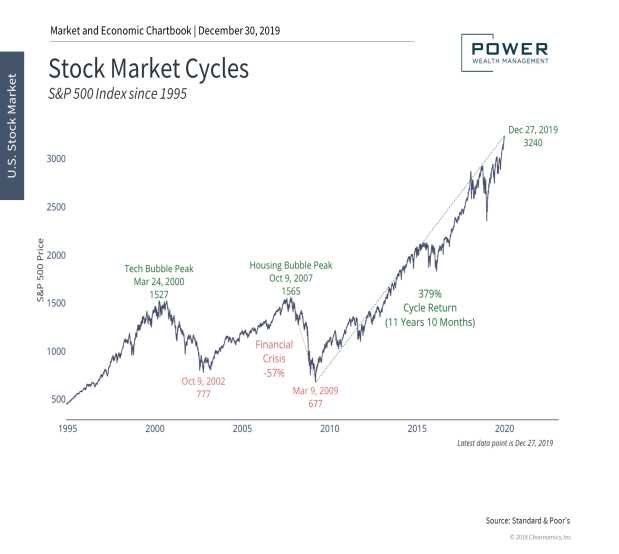
The bottom line? In the long run, it’s economic growth and innovation that matter. There is no simple way to predict stock market returns based on presidential elections. Long-term investors should stay focused and not overly react to day-to-day election coverage.
Thank you for reviewing our Bond Market outlook. Please do not hesitate to reach out to me personally with any questions. We welcome feedback and would love to know what type of material you would be interested in receiving during our next market outlook newsletter.
Click here to schedule a free portfolio review!
Disclosures: The value of debt securities may fall when interest rates rise. Debt securities with longer maturities tend to be more sensitive to changes in interest rates, usually making them more volatile than debt securities with shorter maturities. For all bonds there is a risk that the issuer will default. High-yield bonds generally are more vulnerable to the risk of default than higher rated bonds.
Using diversification as part of your investment strategy neither assures nor guarantees better performance and cannot protect against loss of principal due to changing market conditions.
The opinions expressed in this commentary are those of the author and may not necessarily reflect those held by Kestra Investment Services, LLC or Kestra Advisory Services, LLC. This is for general information only and is not intended to provide specific investment advice or recommendations for any individual. It is suggested that you consult your financial professional, attorney, or tax advisor with regard to your individual situation. Comments concerning the past performance are not intended to be forward looking and should not be viewed as an indication of future results.
Securities offered through Kestra Investment Services, LLC (Kestra IS), member FINRA/SIPC.Investment advisory services offered through Kestra Advisory Services, LLC (Kestra AS), an affiliate of Kestra IS. Power Wealth Management is not affiliated with Kestra IS or Kestra AS. Kestra AS, Kestra IS, and Power Wealth Management do not provide tax or legal advice.
[1] Investments in high yield bonds are high risk investments. High yielding fixed-income securities generally are subject to greater market fluctuations and risk of loss of income and principle than are investments in lower yielding fixed-income securities.
[2] Government bonds are guaranteed by the U.S. Government and, if held to maturity, offer a fixed rate or return and fixed principle value.